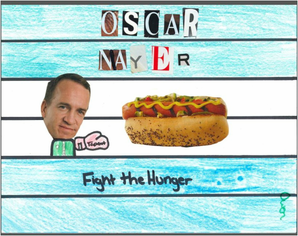
When we started to look through the magazines for ads that gave us ideas on how to create our own, I saw a hot dog ad. It gave me the idea that i could do an ad on quenching your hunger, much like drink ads which often coined the "quench your thirst" slogan. I tried to represent the "literal" fighting the hunger. In the ad, I represented the elements of line and color, as well as the principles of balance and emphasis. The emphasis is on the "fight"in the center of the ad, and the balance is hand and hand with the element of color. The color is equal on both sides of the ad, making it balanced. I also used line to separate the text from the actual ad.
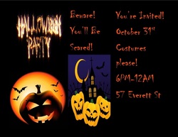
While doing this project, we were supposed to make a Halloween flyer in landscape format, i also used this as my flyer without a template. This clearly shows the when,where,time,and the address of the event. I tried making a collage with the images on the left.
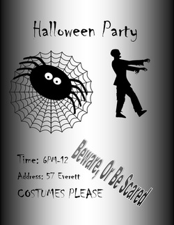
This is the redesigned flyer in black and white. This flyer was redesigned by using a portrait setup rather than the landscape setup of the page meaning it was vertical rather than horizontal. I changed around the images making sure I stayed in the black and white format.
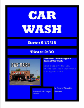
This is flyer number one, a template flyer. I took a predesigned Car Wash flyer and changed it into a flyer marketing the Somerset Little League's annual Car Wash. The most important information is emphasized such as the event that is happening along with the time and date.
I learned how to fill, flip images as well as balance the information on the paper.
I learned how to fill, flip images as well as balance the information on the paper.
|
|
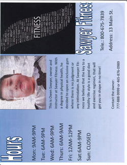
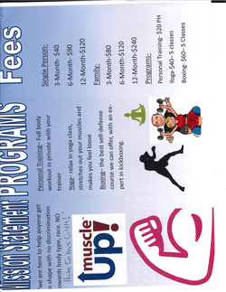
This is the cover, back, and inside flaps of the trifold brochure that is advertising a "business" run by us. I am the owner of the business called Sawyer Fitness. On the front side of the folder, This is the inside of the trifold brochure. I used clip art and word art to give color and variety to the page. I include programs, fees, and the fitness center's mission statement. We had to print the brochure in duplex mode to make sure the print would go on front and back. I looked at gym memberships for places like planet fitness and the Y and i made a realistic market price. This was a good project as it introduced us to duplex printing as well as just being fun to do.
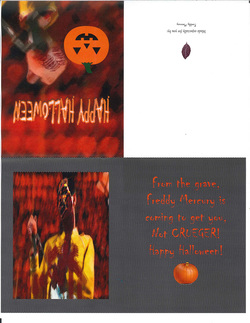
Our assignment was to create a greeting card from a celebrity to us in a season like Halloween and Christmas. I mainly used Photoshop to alter the picture of Freddy Mercury, who the "card" was from. I used the brush and sharpen tools to create the illusion of Mercury with blood on his face coming back from the dead. This was a good project that allowed me to combine my skills on publisher with the Photoshopped picture.
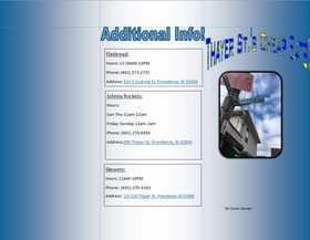
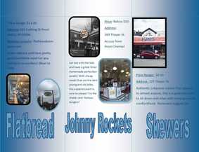
This was a brochure advertising the cheap
eats on thayer street. I included popular spots like Johnny Rockets, Flatbread, and Skewers. I explained the price ranges, locations and what they are excellent at making. They are all located on or near thayer and are only a 20 minute drive away! (From Somerset). In this project i used microsoft and photoshop filters on the pictures to make them look more appealing, and it worked pretty well. I used the gradient background to give the two toned appeal.
eats on thayer street. I included popular spots like Johnny Rockets, Flatbread, and Skewers. I explained the price ranges, locations and what they are excellent at making. They are all located on or near thayer and are only a 20 minute drive away! (From Somerset). In this project i used microsoft and photoshop filters on the pictures to make them look more appealing, and it worked pretty well. I used the gradient background to give the two toned appeal.